Platinum Scraps was originally launched February of 2010 as a vision of several friends who met on the Cricut Message board who wanted to venture out into creating, sharing, and showcasing the many talents each of us possess. Platinum Scraps showcases the diversity in scrapbooking and features designers from all walks of life. To keep the tradition going, each week our design team is challenged to create a unique layout or card based on a sketch that exemplifies their skills and talents. We hope that we inspire your creations and we appreciate your continued love and support as we grow together.

Thursday, May 19, 2011

Tweaks "R" Us

Have you ever created a layout and everyone said it looked great, but there was just that little bit of something you thought was missing.  Today, we are featuring a layout that were showcased on Monday's launch.  There was nothing wrong with the layout as it was, but there is always something you might do to enhance your project. 

You will see the sketch, the layout for launch date, and the new layout with a little something added.

TFL.

The Sketch


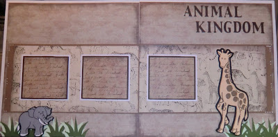
Layout submitted for Launch


Tweaked Layout


Tweaked TIMES Two


The original project was ok according to the sketch, but that white space (empty space) at the top was bothering me.  I decided to go in cut a branch and add a monkey.  It instantly transformed a good layout to a better layout.  I came back and added a branch to the other side of the layout for balance and added ribbon to each photo mat.   

What do you think? 

1 comment:

Related Posts Plugin for WordPress, Blogger...